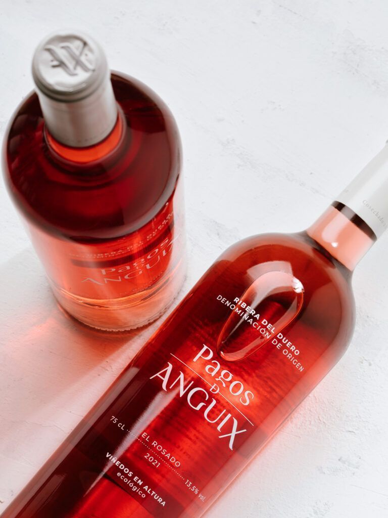
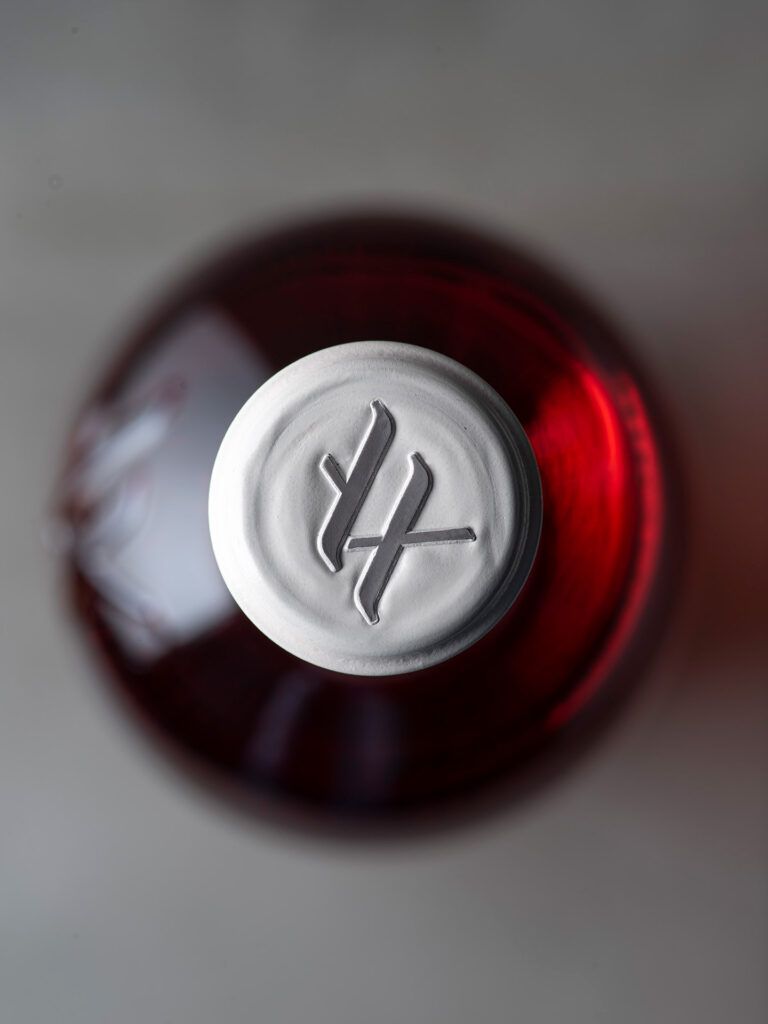
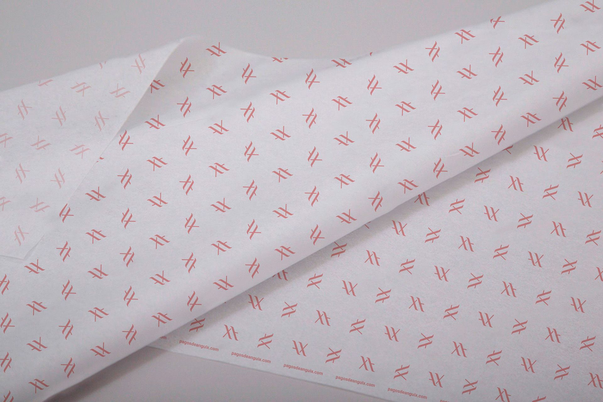
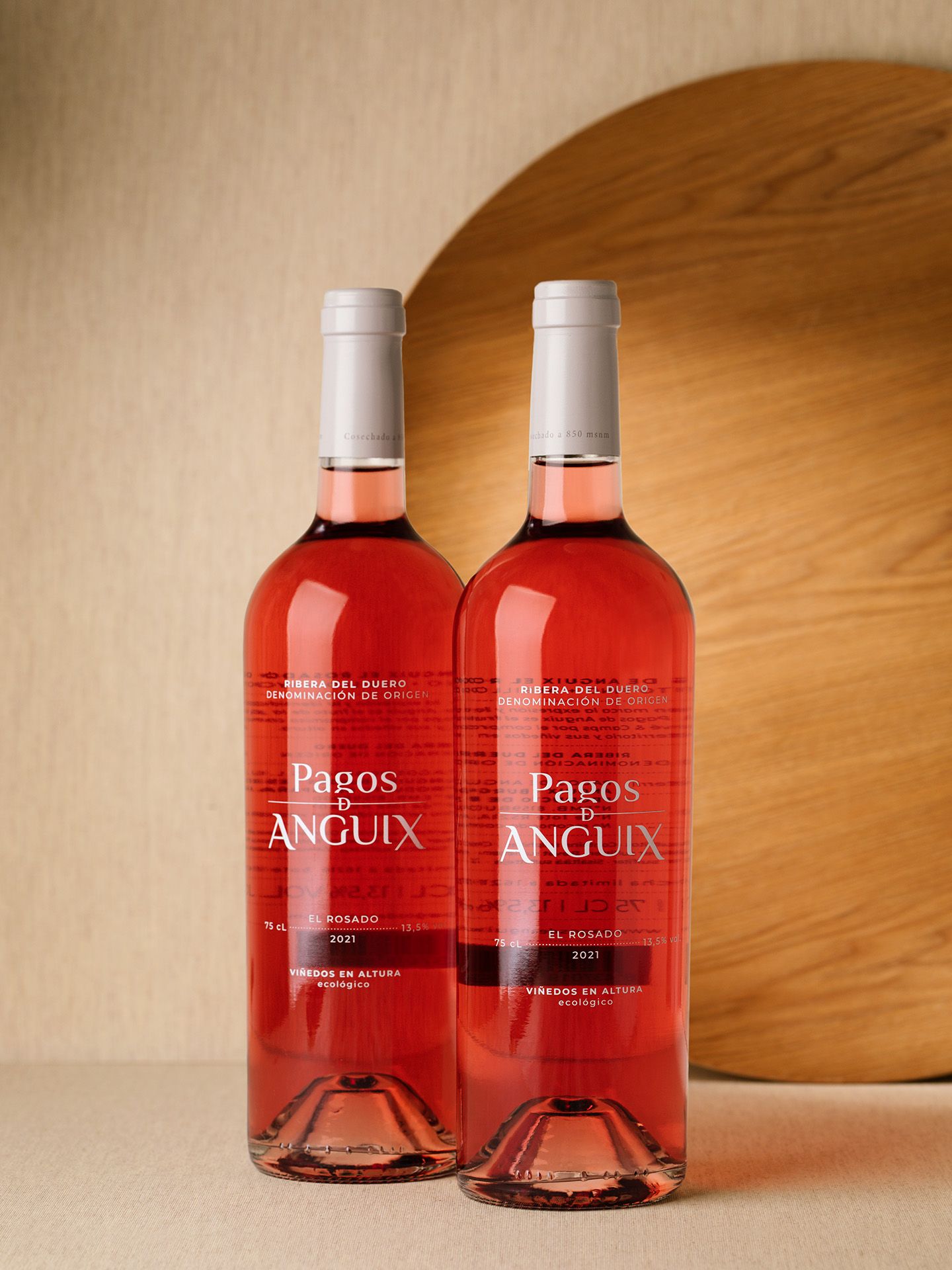
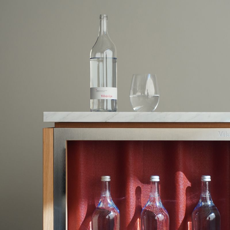
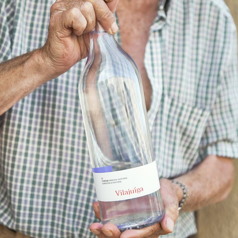
Pagos de Anguix first Rosé. The thing that kept our attention the most when we received the first wine bottle sample before starting the project, was the color of the wine. Clear but intense at the same time, we decided to not cover the transparent bottle with any label, instead we screen print it in white. The same design guidelines from Pagos de Anguix red wines, but paperless . In order to highlight the white serigraphy, we chose a clear grey for the wine cap, making the white even whiter. We hope you like the result as much as we love the wine. Cheers!
We use cookies on our website to give you the most relevant experience by remembering your preferences and repeat visits. By clicking "Accept all", you consent to the use of ALL cookies. However, you can visit "Set my cookies" to give controlled consent.
Este sitio web utiliza cookies para mejorar su experiencia mientras navega por el sitio web. De ellas, las cookies clasificadas como necesarias se almacenan en su navegador, ya que son esenciales para el funcionamiento de las funciones básicas del sitio web. También utilizamos cookies de terceros que nos ayudan a analizar y comprender cómo utiliza usted este sitio web. Estas cookies se almacenan en su navegador sólo con su consentimiento. También tiene la opción de excluirse de estas cookies. Pero la exclusión de algunas de estas cookies puede afectar a su experiencia de navegación.