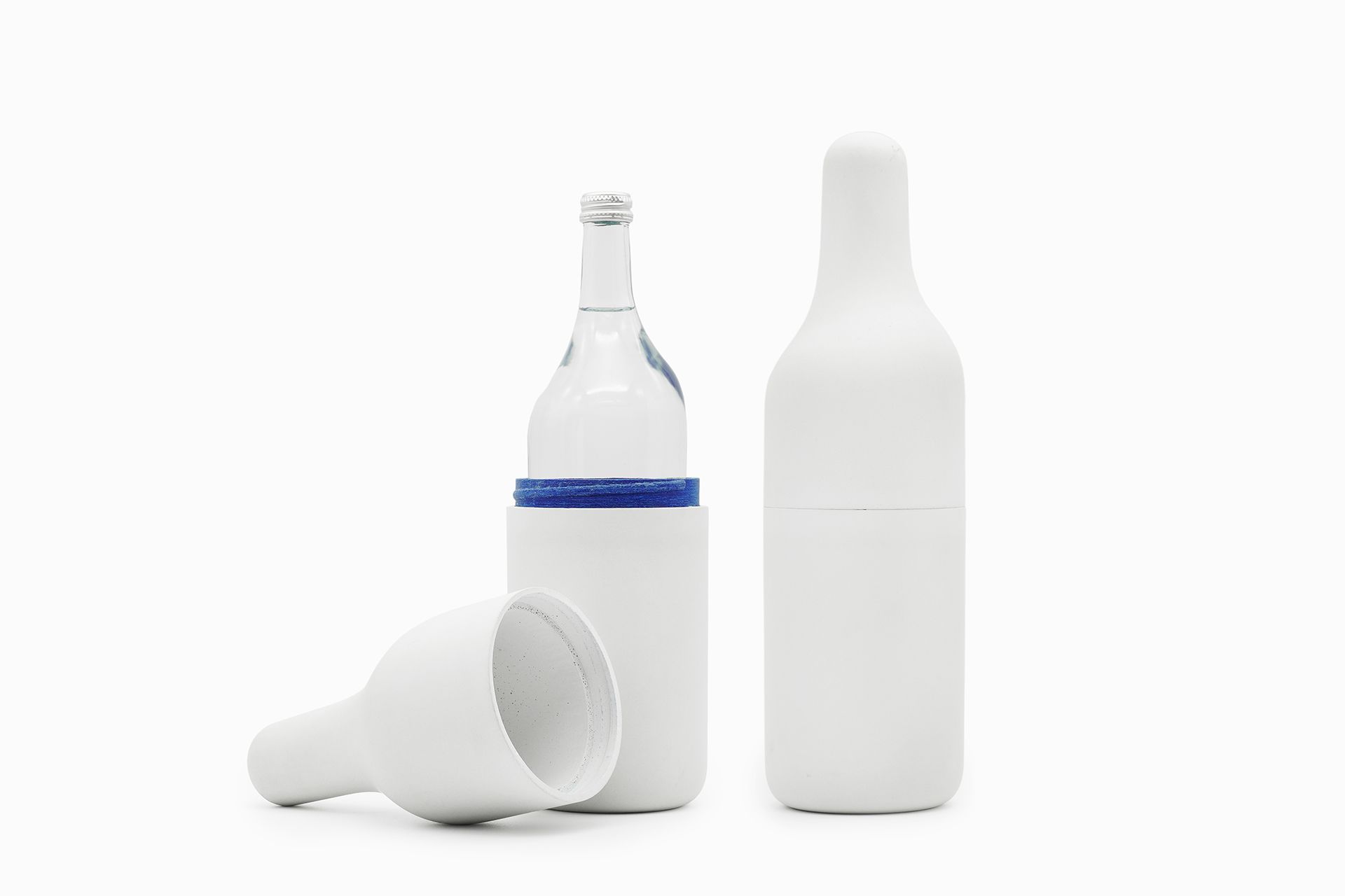
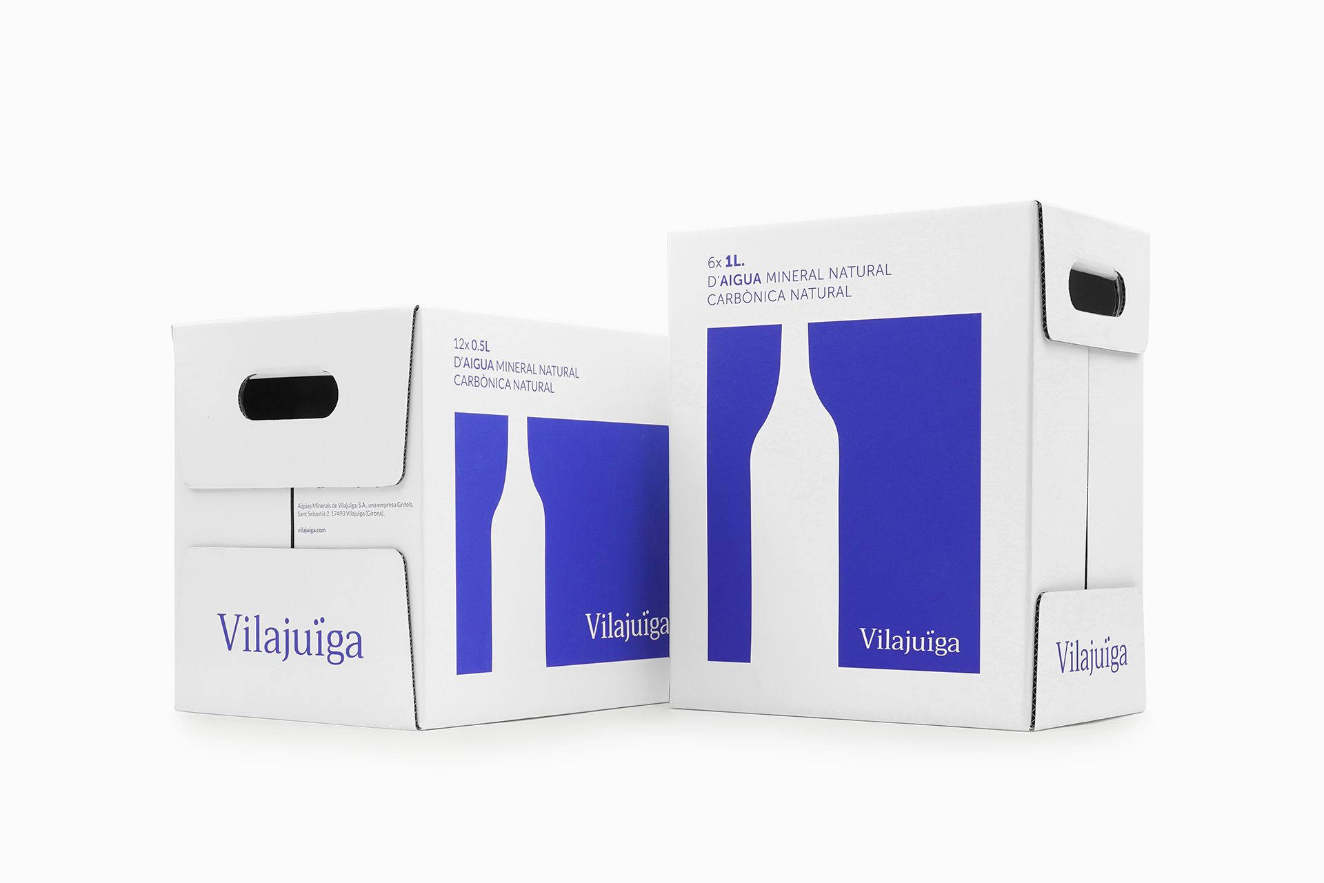
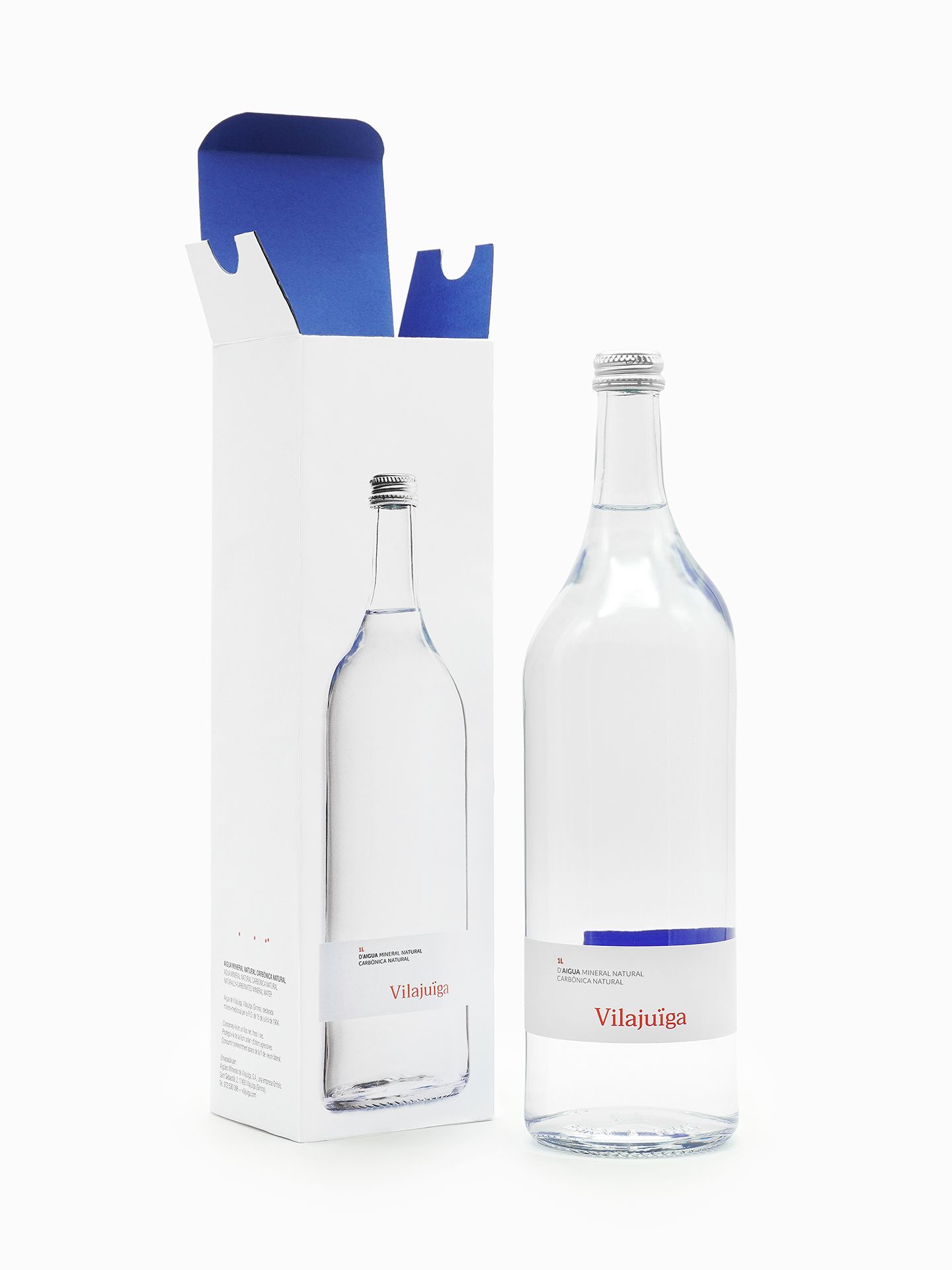
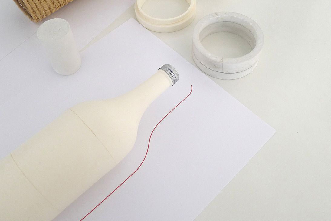
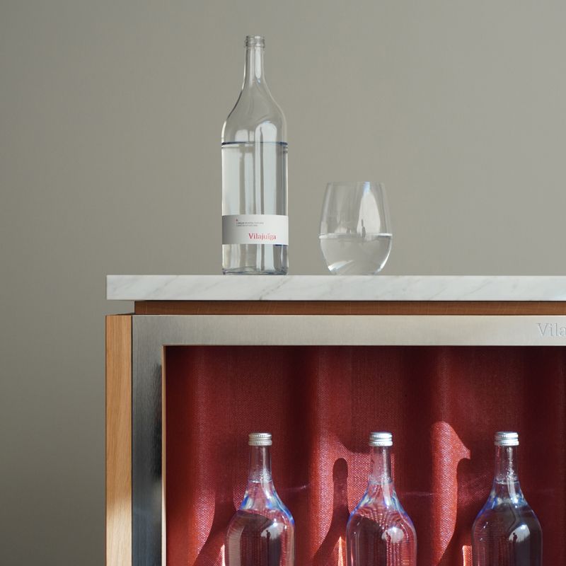
Global design project to relaunch into today’s market the centenary water of Vilajuïga from 1904. We designed a totally renovated brand identity. The characteristics of this unique water inspired us for the design of the logotype and the asymmetry of the bottle. The four dots in the word Vilajuïga represents the natural gas of the water while the particular shape of the bottle make tribute to the territory around Vilajuïga, the Empordà. A region shaped by the winds of the Tramuntana, with rocks sculpted by the rain and a landscape eroded over the course of centuries.
#productdesign #brandstrategy #branding #identity #graphicdesign #logodesign #packaging #manufacturingmanagement
